Color Contrast Checker (WCAG AA / AAA)
Enter a text color and a background color in any CSS format to see the contrast ratio, the WCAG pass or fail for each text size and a fix when it fails.
Recent
Your last 10 settings, saved only in this browser. Nothing is uploaded.
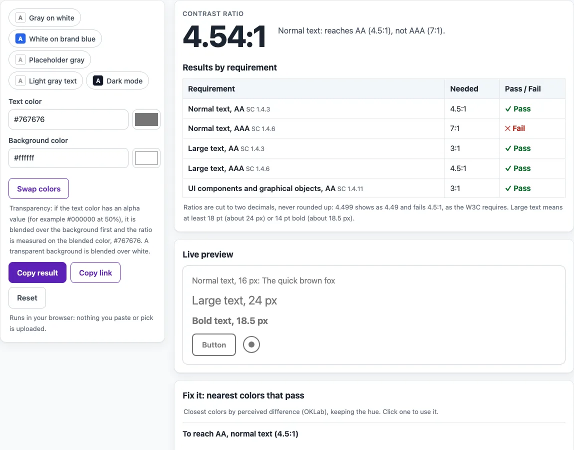
How to use the Color contrast checker
- Type a text color into the Text color field. You can use hex, rgb(), hsl(), or a CSS color name, or pick a color with the color picker.
- Type a background color into the Background color field, using the same options.
- Read the large ratio at the top, for example 4.54:1.
- Check the Results by requirement table. It lists normal text AA (4.5:1), normal text AAA (7:1), large text AA (3:1), large text AAA (4.5:1), and UI components and graphical objects (3:1). Each row shows Pass or Fail as text.
- Look at the Live preview, which shows sample text at 16 px, 24 px, and 18.5 px bold, plus a button and an icon.
- If a pair fails, look at Fix it: nearest colors that pass. It lists the closest text colors and the closest background colors that reach AA (4.5:1) and AAA (7:1); click a suggestion to apply it.
- Open How it was calculated to see the luminance values behind the ratio.
Use Swap colors to reverse the text and background, or click one of the five example chips to start with a sample pair. Copy result copies the outcome, Copy link saves your colors in the URL so you can share the exact pair, and Reset goes back to the starting example.
What does a color contrast checker measure?
A color contrast checker compares two flat colors: the text color and the color behind it. It produces one number, the contrast ratio, which runs from 1 (identical colors) to 21 (black on white). A higher ratio means the two colors differ more in brightness, which makes text easier to read.
How is the contrast ratio calculated?
The ratio is (L1 + 0.05) / (L2 + 0.05), where L1 is the relative luminance of the lighter color and L2 is the relative luminance of the darker one. Relative luminance is calculated from the red, green, and blue values: L = 0.2126 R + 0.7152 G + 0.0722 B.
Each 8-bit channel is first divided by 255 to give a value from 0 to 1. If that value is 0.04045 or less, it is divided by 12.92. Otherwise, it is converted with ((value + 0.055) / 1.055) raised to the power of 2.4. WCAG 2.2 uses 0.04045 as the threshold. Earlier versions of the definition used 0.03928, but the difference does not change any result for 8-bit colors.
As a worked example, #777777 has a linear channel value of 0.18447, so its luminance is also 0.18447. Against white, the ratio is 1.05 / 0.23447, which is 4.478.
How much contrast does WCAG require?
WCAG success criterion 1.4.3 (Level AA) asks for at least 4.5:1 for text and images of text, and 3:1 for large-scale text. Level AAA (1.4.6) asks for 7:1 for text and 4.5:1 for large text. Large-scale text means at least 18 point, or 14 point bold, which is roughly 24 px or 18.5 px bold in CSS. The 4.5:1 level for AA was chosen to compensate for the contrast loss of users with about 20/40 vision.
Criterion 1.4.11 (Level AA, added in WCAG 2.1) asks for 3:1 between adjacent colors for visual information needed to identify UI components and states, and for parts of graphics needed to understand content. The 3:1 requirement covers borders, icons, and similar elements.
The text requirements also apply to placeholder text and to text shown on hover or focus. Some text is exempt, including inactive UI component text, pure decoration, text no one can see, logotypes, and text in a picture that has significant other visual content.
Why does the checker show 4.47:1 instead of 4.5:1?
WCAG says the computed values should not be rounded, so 4.499:1 would not meet the 4.5:1 threshold. The tool compares the exact ratio and displays it cut to two decimals, not rounded. For example, #777777 on white is 4.478:1, shown as 4.47:1, so it fails AA. The lightest neutral gray that passes AA on white is #767676, which gives 4.542:1.
How does the tool handle transparent colors?
WCAG does not give a formula for translucent colors. This tool blends the text color over the background at 8-bit precision, the way a browser does, and then measures the blended color against the background. This is our method, not a W3C rule. Fix suggestions also use our method: a lightness search in the OKLab and OKLCH color spaces that keeps the original hue (see Björn Ottosson’s OKLab post).
What does a color contrast checker not test?
The tool measures two flat colors only. It does not check text over images or gradients, which is covered by the image contrast checker. It does not evaluate font weight beyond the large-text sizes, and it does not check a whole page. Automated checks find only part of accessibility problems. Keyboard use, screen reader behavior, and content review still need manual testing.
Sources (checked 13 October 2026): W3C · W3C (2) · W3C (3) · OKLab (B. Ottosson)
Frequently asked questions
Is the color contrast checker free, and is anything I paste uploaded?
Yes, the tool is free. Everything runs in your browser, so nothing you paste, type, or pick is uploaded. There is no account or sign-up.
Does the checker follow WCAG 2.0?
The tool uses the WCAG 2.2 definitions. The 4.5:1 and 3:1 thresholds for text match those in WCAG 2.0, but the UI component requirement (1.4.11) was added in WCAG 2.1, so it is not part of WCAG 2.0.
Can I check text placed over a background image?
No. The tool compares two flat colors. Text over an image depends on the colors the text actually sits on, so use the image contrast checker for that case.
Does a passing ratio mean my website is accessible?
No. A passing ratio only shows that one pair of colors meets a measurable threshold. The site does not declare pages compliant or accessible, and automated checks cannot cover everything. Manual checks are always needed, and this is not legal advice.
Why does my text look readable even though the pair fails?
Reading comfort depends on the viewer, the text size, and the surrounding design. WCAG uses fixed thresholds so that results are consistent. The 4.5:1 level was set to account for users with reduced contrast sensitivity, so a pair that looks fine may still fail.
What does “Fix it” change?
It suggests the nearest text colors and the nearest background colors that reach AA and AAA for normal text. The suggestions keep the original hue and change lightness. If no color of that hue can reach the level against the other color, it says so. You can click a suggestion to apply it.
Can I test colors that change on hover or focus?
Yes. Enter the text and background colors used in the hover or focus state, and the checker will measure that pair. The text requirements apply to these states as well.
Related tools
- Color contrast finder: Use it when you need to find text and background colors that pass before you pick a palette.
- Color palette contrast checker: Use it to test several color pairs from one palette at once.
- Image contrast checker: Use it to check text placed over photos or other images.
- Color contrast accessibility guidelines: Read it for a fuller explanation of the contrast rules and their exceptions.
- Website accessibility checker: Use it to run broader automated checks across a page.
- ADA compliance checker: Use it to review a site against common ADA-related checks.
- Alt text checker: Use it to review image descriptions that screen reader users depend on.
- Keyboard accessibility test: Use it to check whether you can reach and use controls without a mouse.