Color Contrast Finder
Give your text and background colors and a target ratio; the finder suggests the nearest colors that pass, keeping the hue.
Recent
Your last 10 settings, saved only in this browser. Nothing is uploaded.
Color contrast finder is a free tool that takes a text color and a background color, measures their contrast ratio, and suggests the nearest colors that meet a target you choose. It works as a color contrast picker for text, backgrounds, or both, with targets taken from WCAG 2.2.
The tool runs in your browser. There is no account or sign-up, and nothing you enter is uploaded.
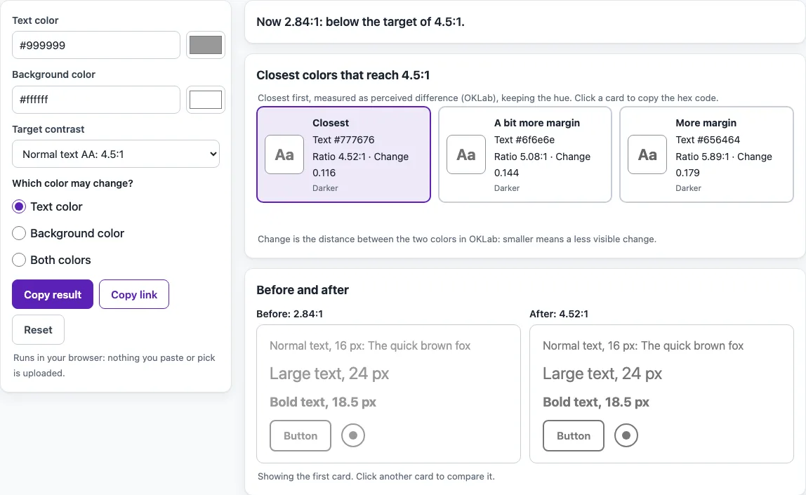
Suggestions appear as up to six cards, closest to your original colors first. Each card shows the new ratio and the size of the change, so you can see how far a color has to move. The tool keeps the hue of each color where it can, which helps suggestions still look like your brand palette. It does not judge design quality or brand fit, so the final choice is yours.
How to use the Color contrast finder
- Enter your color in Text color.
- Enter your color in Background color.
- Choose a Target contrast. The options are AA 4.5:1, AAA 7:1, 3:1 for large text and UI, large AAA 4.5:1, or a custom value from 1 to 21.
- Set Which color may change? to text, background, or both.
- Read the cards. Each one shows the new ratio and how much the color changes; the first is the closest, the next ones leave a bit more margin above the target.
- Click a card to copy its hex code.
- Check the Before and after previews to see the suggested colors next to your originals, then paste the chosen hex code into your stylesheet or design file.
Use Copy result to copy the full set of suggestions as text. Use Copy link to share a link that reopens the same colors and settings. Each card has a copy button, and the Before and after preview updates when you click another card, so you can compare options side by side. Select Reset to go back to the starting example. If the tool says that no color of this hue reaches the target, set Which color may change? to Both colors or choose a lower target.
How is a contrast ratio calculated?
A contrast ratio compares the brightness of two colors and is written as a number from 1:1 (no difference) to 21:1 (black on white, the maximum). The formula is (L1 + 0.05) / (L2 + 0.05), where L1 is the relative luminance of the lighter color and L2 is that of the darker one. Relative luminance is calculated from the red, green, and blue values of each color after they are converted to linear light. If a text color is translucent, it is blended over the background first, so the ratio reflects what the reader actually sees.
What contrast ratio does my text need?
For normal text, WCAG 2.2 criterion 1.4.3 (AA) asks for at least 4.5:1, and criterion 1.4.6 (AAA) asks for 7:1. Large text needs 3:1 under AA and 4.5:1 under AAA. Large text means 18 point or 14 point bold, which is about 24 px or 18.5 px. Non-text elements such as icons, form borders, and graphics need 3:1 under criterion 1.4.11. The targets are defined in WCAG 2.2.
Does a color have to hit the target exactly?
A color only counts if its ratio is at least the target when measured on the rounded 8-bit color values. A ratio of 4.499 does not meet 4.5, so the tool will not treat it as a pass.
How does the tool find a closer color?
The tool works in OKLCH, a perceptual color space developed by Bjorn Ottosson, and keeps the hue and chroma of your color. It then moves lightness toward lighter and toward darker, using bisection to find the nearest value that reaches the target. If a color falls outside the sRGB gamut, its chroma is reduced first. When you choose “both,” text and background move by the same lightness step in opposite directions. The extra cards aim for 12% and 30% more than the minimum ratio (capped at 21). This margin is a design choice of the tool, not a WCAG rule.
What happens when no color can reach the target?
The highest possible ratio is 21:1. If your target is above what the other color allows, no solution exists, and the tool tells you so. In that case, a different color is needed for the other side, since the tool does not search other hues.
Do brand colors have to meet contrast rules?
Brand colors are not exempt for text. WCAG exempts only logotypes, so text that fails contrast because of corporate identity or brand guidelines still needs to meet the target. Adjusting a brand color may be the only way to meet the target.
Sources (checked 13 October 2026): W3C · W3C (2) · W3C (3) · OKLab (B. Ottosson)
Frequently asked questions
Is the color contrast finder free, and is anything I paste uploaded?
Yes, the tools are free, and there is no account or sign-up. Everything runs in your browser, so nothing you paste, type, or pick is uploaded.
Does a passing ratio mean my page is accessible?
No. A passing ratio only shows that a pair of colors meets one contrast criterion. Automated checks find only part of the accessibility issues, so keyboard, screen reader, and content checks are still needed. This is not legal advice.
How are translucent text colors handled?
A translucent text color is blended over the background first. The suggestions the tool returns are opaque colors you can use directly in your design.
Which target should I choose if I am not sure?
Start with AA for normal text, 4.5:1. Level AA is the level used by the U.S. ADA Title II web rule (WCAG 2.1 AA) and by the Revised Section 508 Standards (WCAG 2.0 AA). Use 3:1 only for large text or for icons, borders and other non-text parts.
Why does the suggested color look a little different from my brand color?
The tool keeps the hue and changes only lightness. Very saturated colors can fall outside the range a screen can show once they are made lighter or darker, so the tool lowers their saturation (chroma) first, which can make them look slightly duller.
What does the tool not check?
It does not judge design quality or brand fit, and it does not search other hues. For non-text elements, it only checks the 3:1 target.
Related tools
- Color contrast checker - use it to test one pair of colors and see whether the ratio meets your target.
- Color palette contrast checker - use it when you need to check several colors from a palette at once.
- Image contrast checker - use it when your text sits on a photo or image background.
- Color contrast accessibility guidelines - read it for a plain-language overview of the contrast rules behind the targets.
- Website accessibility checker - use it to look for other accessibility issues beyond color contrast.
- WCAG 2.2 checklist - use it to track the rest of the WCAG 2.2 criteria during a manual review.