Color Contrast Accessibility Guidelines (WCAG)
Pick what the color is used for and the level you aim for to see the required contrast ratio, the WCAG rule and its exceptions.
Recent
Your last 10 settings, saved only in this browser. Nothing is uploaded.
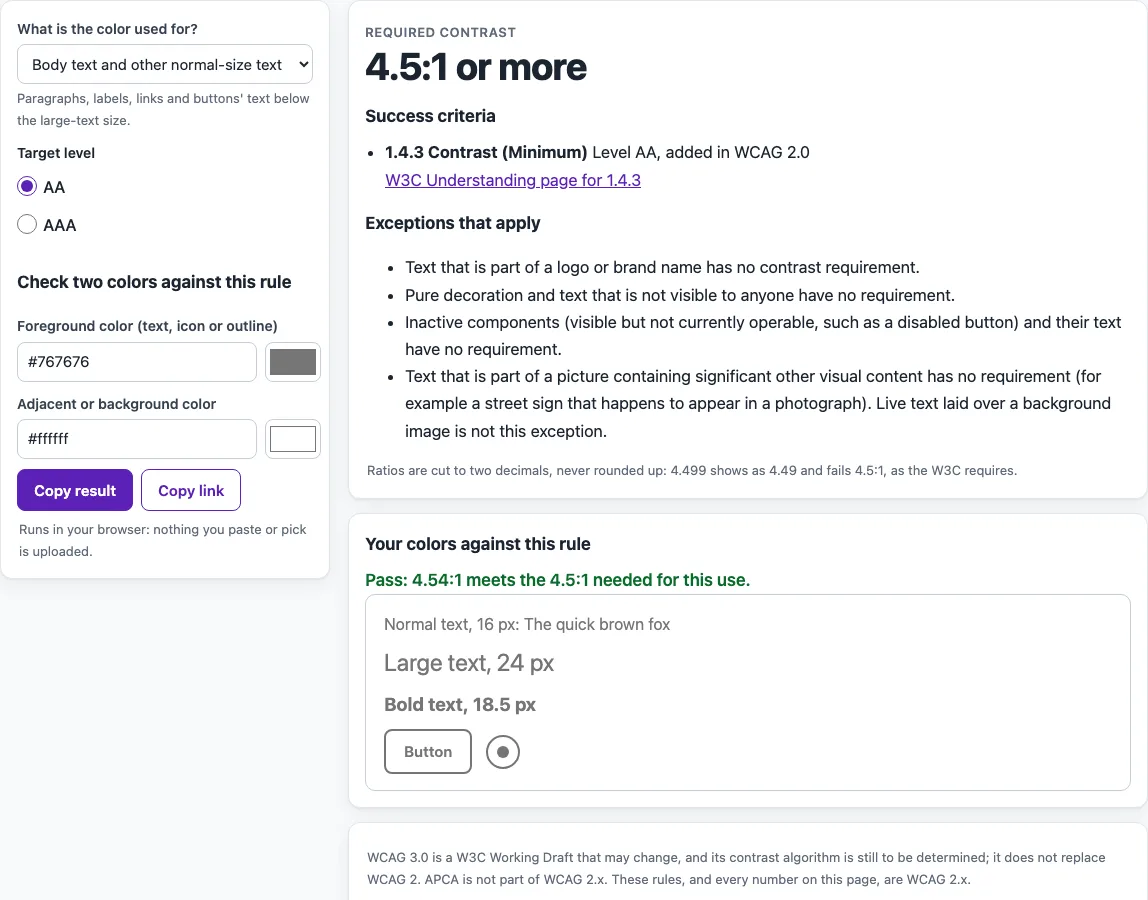
How to use the Color contrast guidelines tool
- Open “What is the color used for?” and choose the use that fits your color, such as body text, large-scale text, a control’s boundary, a focus indicator, placeholder text, a disabled control, a logo, or text over an image. There are 10 uses to pick from, and each one maps to the WCAG rule that covers it.
- Under “Target level”, choose AA or AAA.
- Read “Required contrast” to see the ratio the rule asks for.
- Check “Success criteria” for the level, the WCAG version, and the W3C Understanding link.
- Read “Exceptions that apply” and “Good to know” before you decide whether the rule covers your color. A logo or a disabled control, for example, has no contrast requirement at all.
- In “Check two colors against this rule”, enter your text color in the foreground field and your background color in the background field.
- Read the Pass or Fail result with its exact ratio, and look at the preview.
- Change the use or the level at any time; the requirement and the result update straight away.
- Use “Copy result” to copy the outcome, or “Copy link” to copy a link that reopens the same use, level and colors.
What is a WCAG contrast ratio?
A WCAG contrast ratio compares the brightness of a foreground color with the brightness of its background. It is written as a number such as 4.5:1, where higher numbers mean more difference between the two colors. WCAG sets minimum ratios so that people with low vision or color vision deficiencies can read text and see important shapes.
The ratio is not rounded. A result of 4.499:1 fails a 4.5:1 requirement, so a color pair must reach the number itself. The rule also depends on the size of the text. Under 1.4.3 Contrast (Minimum), normal text needs 4.5:1, while large-scale text needs 3:1. Large-scale text is at least 18 point, or 14 point bold, which is about 24 CSS pixels or 18.5 CSS pixels bold.
Non-text parts follow a different rule. Under 1.4.11 Non-text Contrast, visual information needed to identify a user interface component or state needs 3:1 against adjacent colors. A control’s boundary is only required when there is no other visual way to identify the control. A clearly visible text label is enough.
How do AA and AAA levels differ for color contrast?
Level AA is the level used by the U.S. ADA Title II web rule (WCAG 2.1 AA) and the Revised Section 508 Standards (WCAG 2.0 AA). Level AAA is stricter. Under 1.4.6 Contrast (Enhanced), normal text needs 7:1 and large-scale text needs 4.5:1. The same exceptions apply at both levels, including inactive user interface components, pure decoration, invisible text, and logotypes.
WCAG 2.2 has no AAA criterion for non-text contrast. At level AAA, the 3:1 figure from 1.4.11 is the number that applies.
Do focus indicators have a contrast requirement?
Under 2.4.7 Focus Visible (Level AA) the keyboard focus must be visible, and the parts of a focus indicator needed to see it count as non-text content under 1.4.11, so they need 3:1 against adjacent colors. WCAG 2.2 added 2.4.13 Focus Appearance at Level AAA: the indicator must be at least as large as a 2 CSS pixel thick outline around the control and show 3:1 between its focused and unfocused states.
Color is also covered by a separate rule. Under 1.4.1 Use of Color, which is Level A, color must not be the only way to convey information. A passing contrast ratio does not replace that check.
Frequently asked questions
Is the tool free, and is anything I paste uploaded?
Yes, the tool is free, and there is no account or sign-up. It runs in your browser, so nothing you paste, type, or pick is uploaded.
What contrast ratio does normal text need under WCAG AA?
Normal text needs at least 4.5:1 at level AA. Large-scale text, which is at least 18 point or 14 point bold, needs at least 3:1.
Do logos need to meet contrast rules?
Text that is part of a logo or brand name has no contrast requirement. Brand guidelines do not exempt other text on the page, though.
Do disabled buttons need to meet the contrast ratio?
No. An inactive component is visible but not currently operable, such as a disabled button, and it has no contrast requirement.
Does a Pass result mean my website is accessible?
No. Automated checks find only part of the accessibility issues, so keyboard, screen reader, and content checks are still needed. This is not legal advice.
Does placeholder text need to meet the contrast ratio?
Yes. Placeholder text inside a form field is text, so 1.4.3 applies: 4.5:1 against the field background at Level AA, or 3:1 if it is large-scale text.
Does the tool check APCA?
No. APCA is not part of WCAG 2.x, and this site does not compute it.
Related tools
- Color contrast checker for checking a single foreground and background pair when you already know the colors you want to test.
- Color contrast finder for finding a readable color to pair with a color you already use.
- Color palette contrast checker for testing several colors from one palette against each other.
- Image contrast checker for checking contrast in an image or screenshot.
- Website accessibility checker for running broader automated checks on a page.
- WCAG 2.2 checklist for reviewing the other success criteria that sit alongside contrast.