Color Palette Contrast Checker
Paste your palette, one color per line, to see every text-on-background pair with its ratio and WCAG level.
Recent
Your last 10 settings, saved only in this browser. Nothing is uploaded.
The color palette contrast checker tests every pair of colors in a palette and reports the contrast ratio and WCAG level for each one. You enter 2 to 16 colors, and it builds a matrix that shows how each color looks as text on each background. It runs in your browser, is free, and needs no sign-up.
It is most useful when you are choosing design tokens, such as text colors on surface colors, or UI and border colors on surfaces. The checker gives you the numbers and levels, so you can see which combinations are safe to use and which need a different shade.
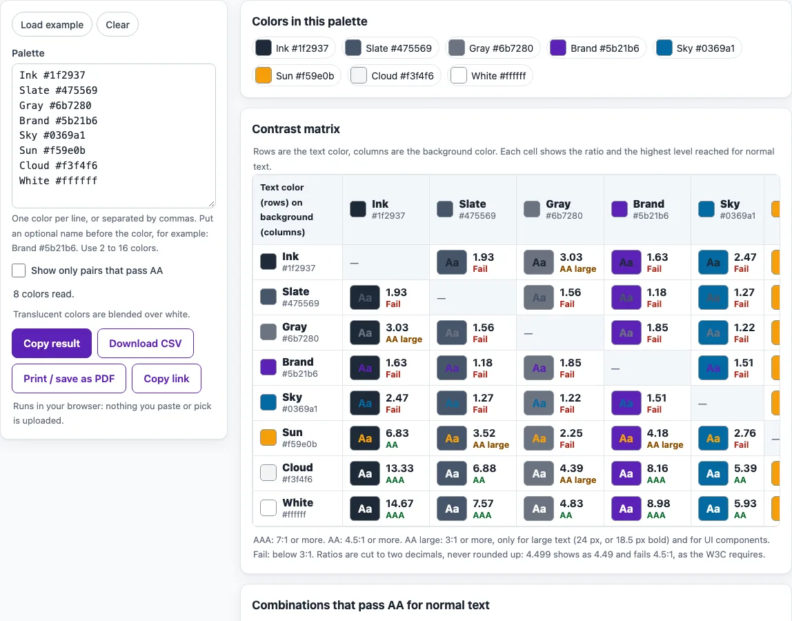
How to use the color palette contrast checker
- Click in the Palette field.
- Enter 2 to 16 colors, one per line or separated by commas. You can add a name before each color, for example
Brand #5b21b6. Hex (3, 4, 6 or 8 digits),rgb(),hsl(), the CSS named colors andtransparentare all accepted. - To see sample data first, click Load example. To start again, click Clear.
- Read the Contrast matrix. Rows are text colors and columns are backgrounds. Each cell shows the ratio and its level: AAA, AA, AA large or Fail.
- Tick Show only pairs that pass AA to hide the failing cells.
- Look at the Combinations that pass AA for normal text list; its count shows how many pairs reach 4.5:1. It is sorted by ratio, so the strongest pairs appear first.
When you are done, use Copy result, Download CSV, Print / save as PDF or Copy link to keep your results. On narrow screens, the matrix scrolls sideways so you can reach every cell. The level in each cell is the highest one the pair reaches for normal text. A cell marked AA large means the pair is usable only for large text (24 px, or 18.5 px bold) and for UI components and graphics, not for body text.
How is the contrast ratio calculated?
The tool uses the WCAG 2.2 formula: (L1 + 0.05) / (L2 + 0.05). L1 is the relative luminance of the lighter color and L2 is the relative luminance of the darker one. Relative luminance is a brightness value calculated from the red, green and blue channels of a color.
The ratio runs from 1:1 for identical colors to 21:1 for black on white. Because the formula uses both colors, A on B gives the same ratio as B on A. The matrix still lists both directions so you can read each text and background role. Translucent colors are flattened over white before they are measured.
What do AAA, AA, AA large and Fail mean?
AAA means 7:1 or more, which meets WCAG 1.4.6 for normal text. AA means 4.5:1 or more, which meets WCAG 1.4.3 for normal text. AA large means 3:1 or more, which applies to large text under 1.4.3 and to UI components and graphics under 1.4.11. Fail means the ratio is below 3:1.
Large text is 18 point or larger, or 14 point and bold. That is about 24 px or 18.5 px bold. Use the AA large label only for text of that size.
Why does a ratio of 4.499:1 fail at 4.5:1?
Ratios are not rounded up before the comparison. A value of 4.499:1 is below 4.5:1, so it fails AA for normal text. The tool shows ratios cut to two decimal places, so rely on the level label rather than rounding the number yourself.
How do I use the matrix for design tokens?
Read across the row of each text color you plan to use and stop at the backgrounds it will sit on. Body text and small labels need AA (4.5:1). Input borders, focus rings and icons that carry meaning need 3:1 against the colors next to them (WCAG 1.4.11), so a border color is checked against the surface it sits on, not against the text.
Does a passing palette make a website accessible?
No. A passing ratio only covers one part of accessibility. WCAG 1.4.1 (Use of Color, Level A) also says color must not be the only way to show information, so links and errors need more than a color change. Automated checks find only some problems, and keyboard, screen reader and content checks are still needed.
Frequently asked questions
Is the tool free, and is anything I paste uploaded?
The tool is free, and there is no account or sign-up. Everything runs in your browser, so the colors you paste, type or pick are not uploaded anywhere.
Do I need to check every pair in my palette?
No. The tool cannot tell which pairs your design uses. Unused pairs can fail without causing any problem, so focus on the combinations that appear in your interface.
Why does a 16-color palette show 240 cells but 120 pairs?
The matrix has 16 × 15 = 240 ordered cells, one for each text and background role. Because the ratio is the same in both directions, there are only 16 × 15 ÷ 2 = 120 distinct pairs.
What is in the CSV file?
One row per text and background pair, with the text name and color, the background name and color, the contrast ratio and the level. You can open it in any spreadsheet program to sort or filter the pairs.
Are text in logos or brand names checked?
No. Text in logos and brand names has no contrast requirement under WCAG. Ordinary text in brand colors does need to pass.
Can I check text placed over an image?
Not with this tool. Text on images needs the image contrast checker, because the background is not a single color.
Related tools
- Color contrast checker - Use it to check one text and background pair at a time.
- Color contrast finder - Use it to find a nearby shade that passes when your first choice fails.
- Image contrast checker - Use it when text sits over a photo or other image.
- Color contrast accessibility guidelines - Use it to read the rules behind the levels and thresholds.
- Website accessibility checker - Use it to run broader checks on a whole page.
- WCAG 2.2 checklist - Use it to track the manual checks that automated tools cannot do.