Image Contrast Checker (Text on Images)
Open an image, then click the text and background colors or drag a box over text to measure its contrast against WCAG.
Recent
Your last 10 settings, saved only in this browser. Nothing is uploaded.
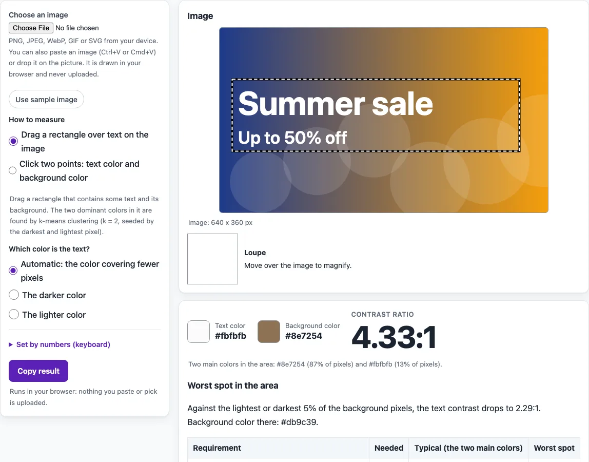
How to use the Image contrast checker
- Choose an image. Pick a file, paste one, or drop it onto the box. To try the tool first, select “Use sample image”, which is a generated gradient with text.
- Pick a mode. Select “Drag a rectangle over text on the image” or “Click two points: text color and background color”.
- In rectangle mode, drag a box over the text. Set “Which color is the text?” to automatic, darker, or lighter if the automatic choice is wrong.
- In click mode, click a text pixel, then a background pixel. Watch the loupe readout to check the exact spot before you click.
- Set the sample size to exact pixel, 3 x 3, or 5 x 5. A larger sample smooths out small variations in the pixels.
- If your browser supports it, select “Pick from screen” to open the browser’s own color picker.
- To enter values exactly, type them into the “Set by numbers (keyboard)” fields.
- Read the table of the five requirements. Each row shows Pass or Fail.
When you are finished, select “Copy result” to copy the result. Keyboard users can reach the number fields and controls without a mouse. Image files larger than 40 MB are not opened, so export a smaller copy of very large artwork first.
How does the tool find the text and background colors?
In rectangle mode, the pixels inside your box are grouped into two clusters using k-means with k = 2. The starting points are the darkest and lightest pixels by relative luminance, and the process runs for up to 24 rounds with the same result every time. Each cluster’s color is the mean of its pixels. This is our own method, not a W3C procedure, so click mode is the better choice when you need to set the colors yourself.
Why must text over a photo pass everywhere?
Contrast is measured against the background the text is rendered over in normal use. Text over a photo therefore has to pass wherever it sits, not only where it looks clearest. WCAG failure example F83 describes “using background images that do not provide sufficient contrast with foreground text.” The worst spot estimate compares the text color with the background’s 5th and 95th luminance percentiles and its mean, then reports the lowest ratio. Because it is an estimate for one rectangle, measure each line of text.
Which contrast ratio do I need?
Normal text needs 4.5:1 for AA and 7:1 for AAA. Large text needs 3:1 for AA and 4.5:1 for AAA. User interface components and graphics need 3:1 (1.4.11). The tool compares exact ratios with these thresholds, so a ratio of 4.499:1 fails the 4.5:1 requirement.
When does the picture exception apply?
Text that is part of a picture containing significant other visual content has no contrast requirement, such as a street sign that happens to appear in a photograph. Live text placed over a background image is not exempt. Images of text fall under the same contrast requirement, as covered in 1.4.5 Images of Text.
Why can a measured ratio differ slightly from the colors I expect?
Anti-aliased edges blend the text and background, which pulls the averages toward each other, so very small text may measure a little lower than its nominal colors. Partly or fully transparent pixels are blended over white before measuring, and images larger than 1600 px on the long side are scaled down for measuring. Dark overlays or text shadows added in CSS are not in the image pixels, so test them in the page or use the color checker with the overlay’s blended color.
Sources (checked 13 October 2026): W3C · W3C (2) · W3C (3) · WICG
Frequently asked questions
Is the tool free, and is anything I paste uploaded?
Yes, the tool is free, and nothing you paste, type or pick is uploaded. The image is drawn on a canvas inside your browser, and there is no account to create.
Can this tool confirm that my page meets WCAG?
No. The tool checks the colors in the image you choose, and automated checks find only part of accessibility issues. Keyboard testing, screen reader testing, and content review are still needed. This is not legal advice.
What should I do if the worst spot fails?
Measure each line of text separately, since the estimate covers only the rectangle you selected. Adjust the text or background color, then check the new values with the number fields until the lowest ratio meets the threshold you need.
Does the tool test video or read the words in an image?
No. It does not read text from the image, find text areas by itself, or test video. You choose the area or the points yourself.
Why is the “Pick from screen” button missing?
It uses the EyeDropper API, which is available in some Chromium-based browsers only. In other browsers, use click mode on the image or type the colors into the number fields.
Related tools
- Color contrast checker - Use it to compare two colors you already know without an image.
- Color contrast finder - Use it when you are choosing colors and want to compare options.
- Color palette contrast checker - Use it when you want to check several color pairs from one palette.
- Color contrast accessibility guidelines - Read it to understand the rules behind the thresholds.
- Website accessibility checker - Use it to look for other issues across a whole page.
- WCAG 2.2 checklist - Use it to track the manual checks that no automated tool covers.